


You Can’t Always Get What You Wind
Australia needs more wind, a lot more wind.
In the nation’s 2026 planning document*, operators of Australia’s grid call for a substantial wind build-out as coal retires and demand grows. Nonetheless, investments have slowed substantially: onshore wind financial commitments fell 59% in 2025, with just 0.9 GW reaching financial close.
In terms of what that looks like on the ground, only 4 out of 31 wind projects backed by the federal government’s Capacity Investment Scheme have reached financial close as of August 2026.
Depending who you ask, higher required returns, rising project costs, connection risk and increasingly complex price capture are all to blame.
Before we dive into the actual data, it’s important to first understand just how much wind has already changed the National Electricity Market (NEM).
From sideshow to system player
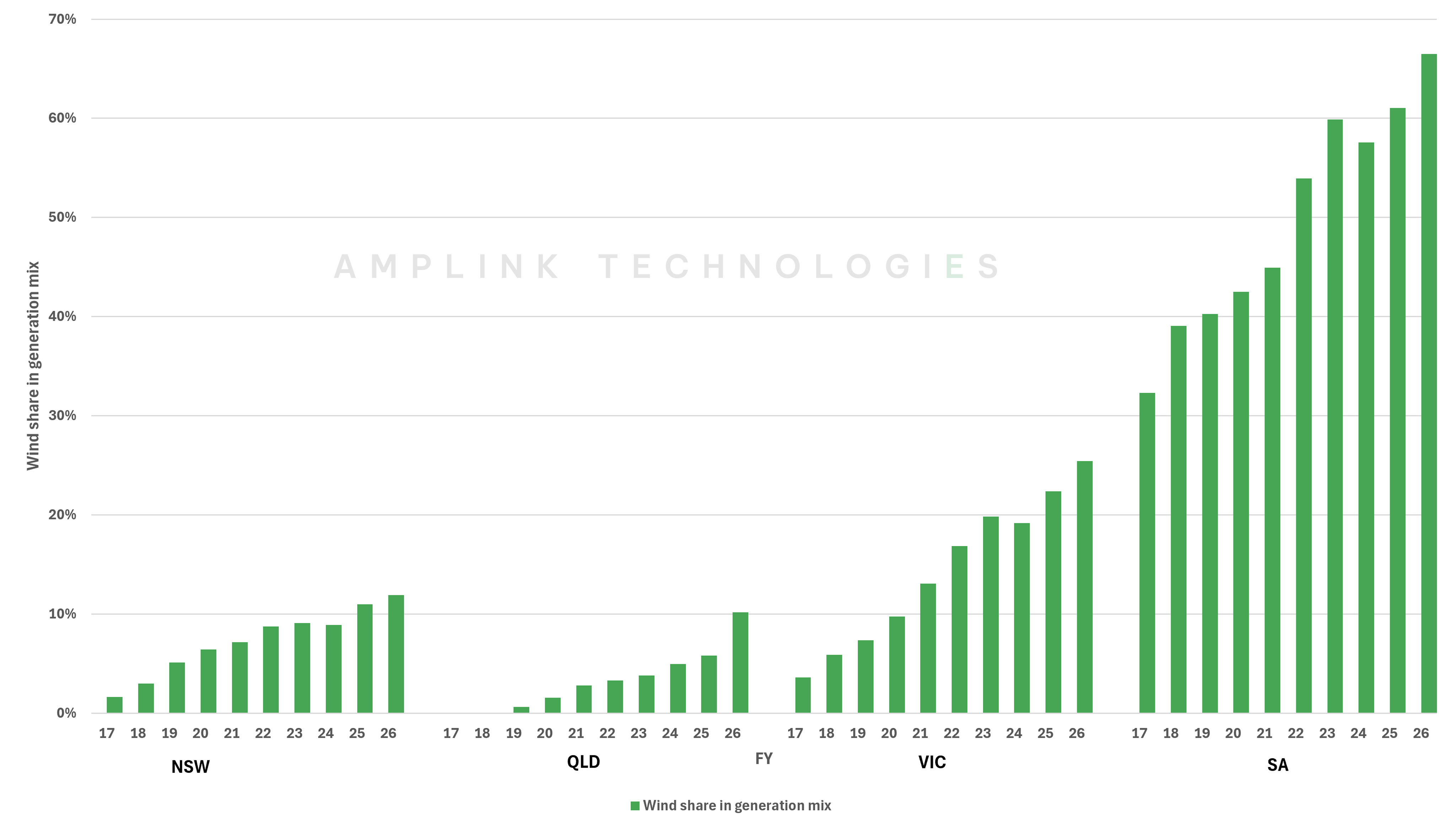
A decade ago, wind occupied a modest place in much of the NEM. While South Australia (SA) and Victoria were already well down the path, in New South Wales (NSW) and Queensland wind was slow to establish itself as a noteworthy contributor. Interestingly, wind share in South Australia a decade ago (32%) is about 3 times higher than the share in NSW today (12%).
Even so, the past decade has seen wind’s share rise in every mainland NEM region. This growth has changed the economics of the market.
As regional wind fleets have grown, output has become more correlated. The same weather system can lift generation across multiple projects, injecting large volumes of power into the market at once. Like solar, wind tends to cannibalise its own prices in this way – the more generators ride the same weather pattern, the more the wholesale spot price depresses during the wave.
Windfallin’
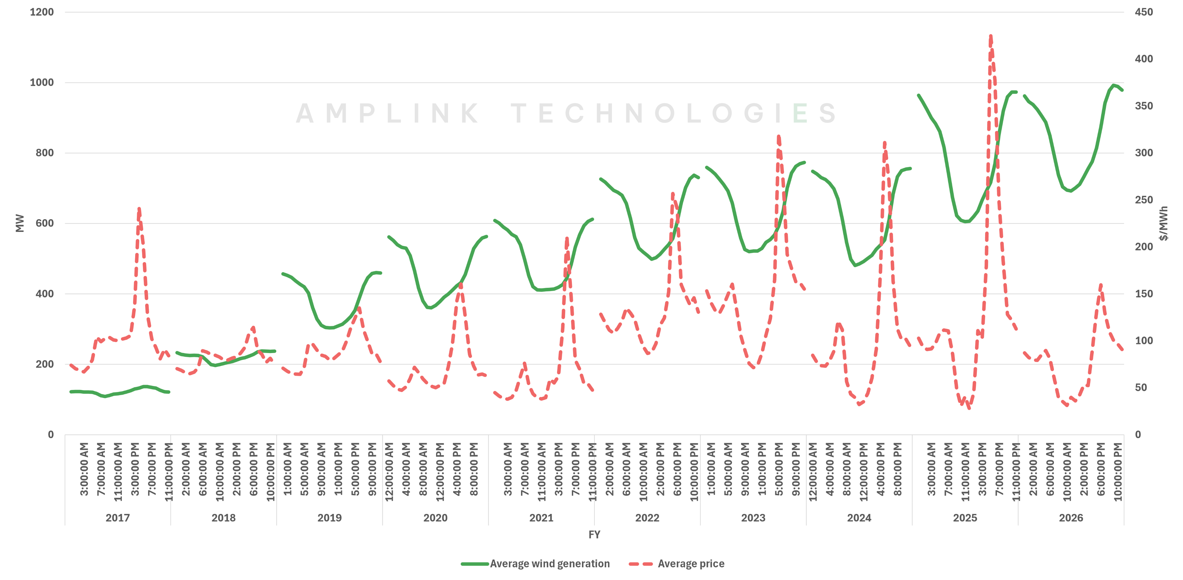
The daily shape of wind in NSW is a good starting point.
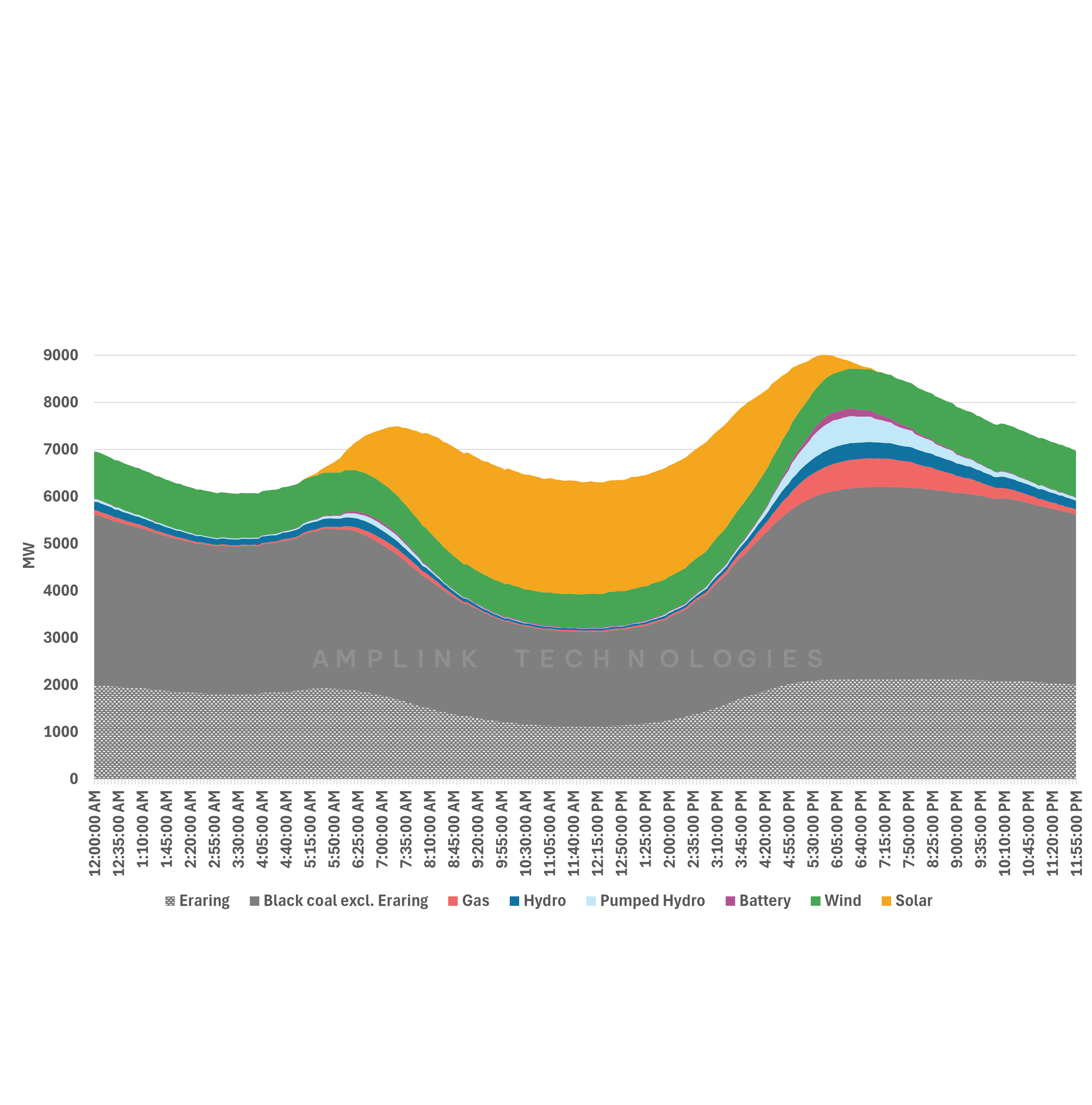
As seen in Figure 2, wind output there tends to ease through the solar-heavy middle of the day before strengthening into the evening. Around seven years ago, average overnight wind output was roughly 33% higher than midday output; today that gap is around 30%.
This daily shape is a persistent feature of NSW wind and has generally worked in its favour as it naturally avoids some of the most crowded hours and produces more as the system moves towards the evening peak.
Stuck in the middle with you
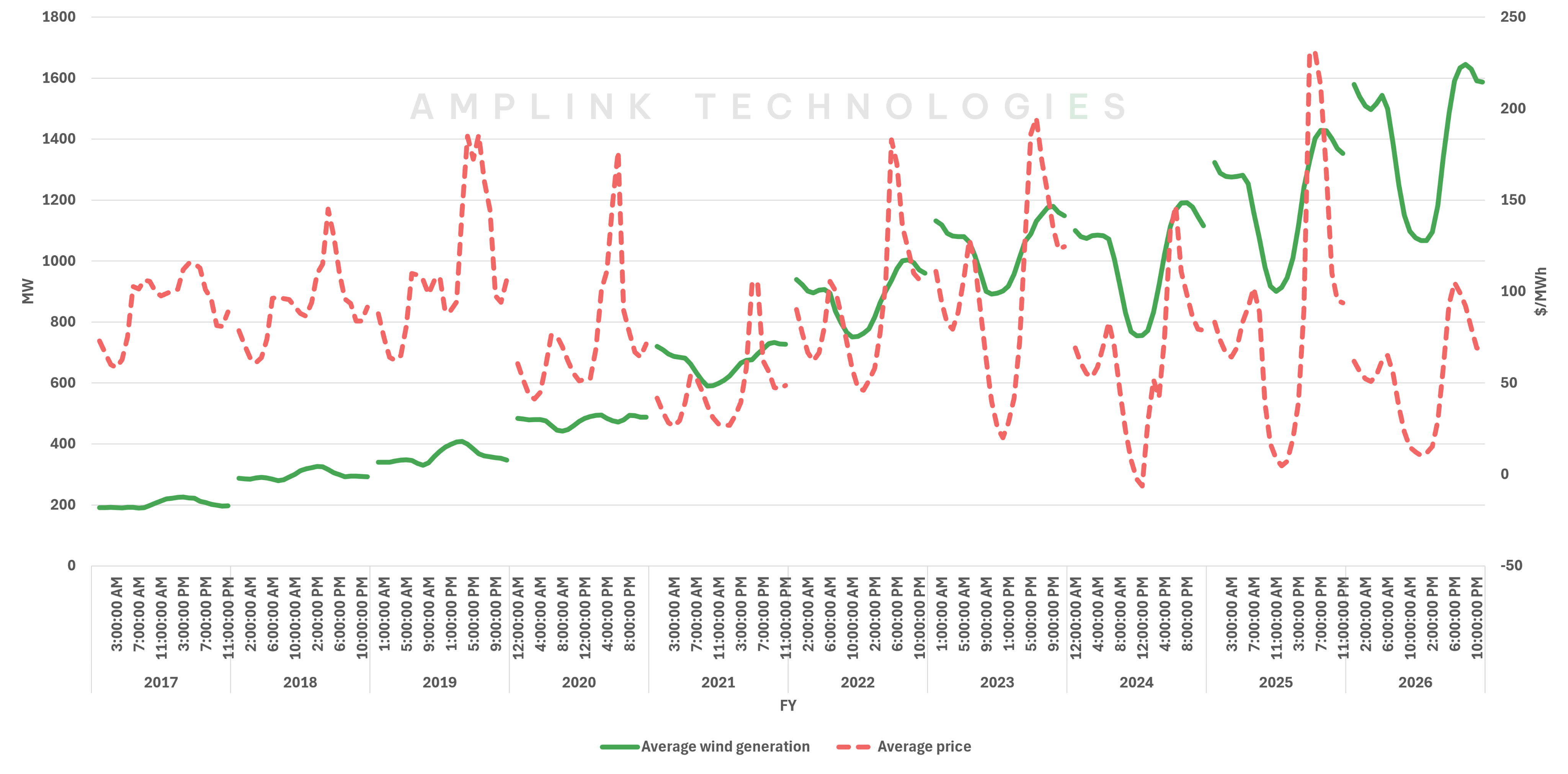
Victoria provides a clear contrast to NSW. Its wind profile has historically been stronger through the middle of the day, and so it overlaps with the period when solar (grid and rooftop) output is highest and wholesale prices are under the most pressure.
Around seven years ago, average Victorian midday wind output was roughly 5% above overnight levels. Today, that relationship has reversed to 32% below overnight levels.
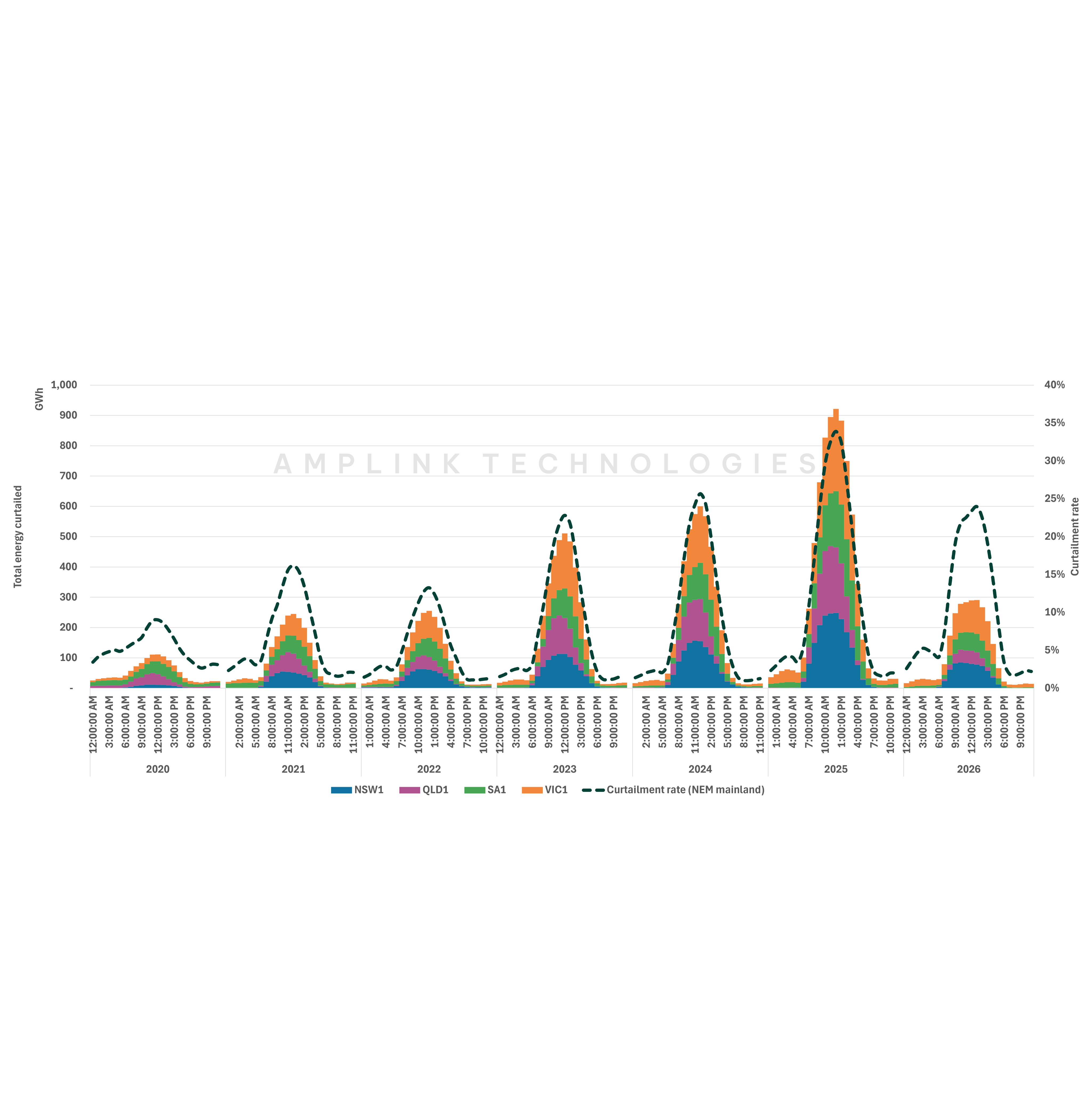
As detailed in previous editions of Watt’s the Story, daytime (9AM – 1PM) curtailment of wind in Victoria has increased from around 1% to 35% over the same period. This is consistent with the market increasingly influencing which energy gets dispatched through both economic and system curtailment, particularly during periods of strong solar output, low demand and negative prices.
There is another factor contributing (albeit to a much lesser extent) to this daytime “erosion” of wind volumes and that is the increasing geographic diversity in wind assets. Victoria’s wind fleet is no longer concentrated in western Victoria, and new projects are exposed to different local wind regimes which may also be mildly influencing the aggregate shape of the state’s wind profile.
Nonetheless, Victoria’s current wind profile seems to be less reflective of the underlying resource and more responsive to price signals. Its daily profile shape now looks similar to NSW, albeit for very different reasons.
This changes what counts as “good wind” for investors. A strong resource and high-capacity factor are no longer enough; value now depends on when electrons are being generated, how closely output tracks the wider fleet, and of course curtailment.
Now let's turn to how changing generation patterns translate into realised prices.
Top Shelf, Bottom Drawer
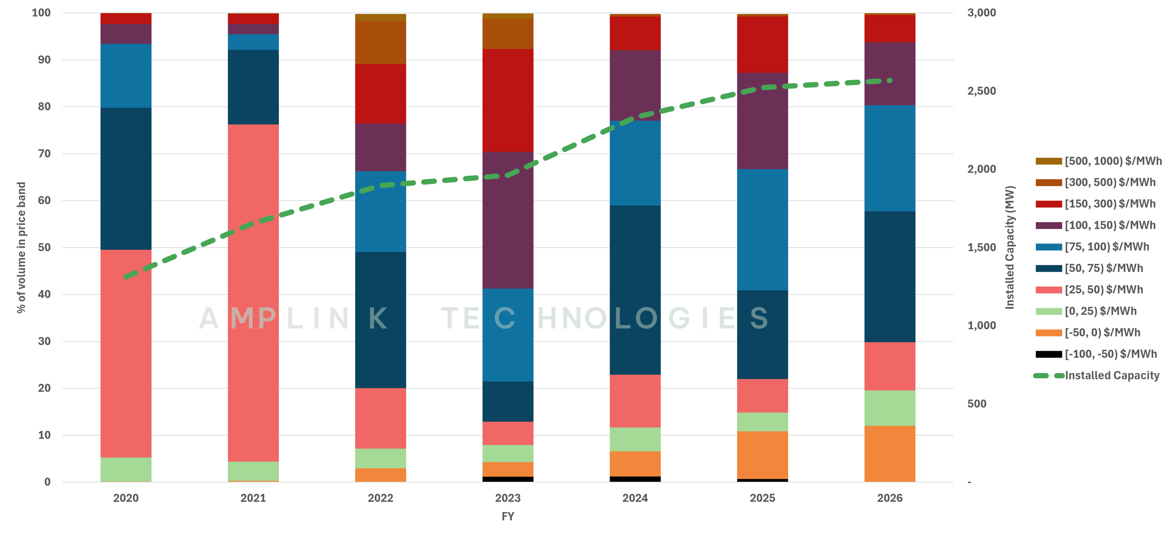
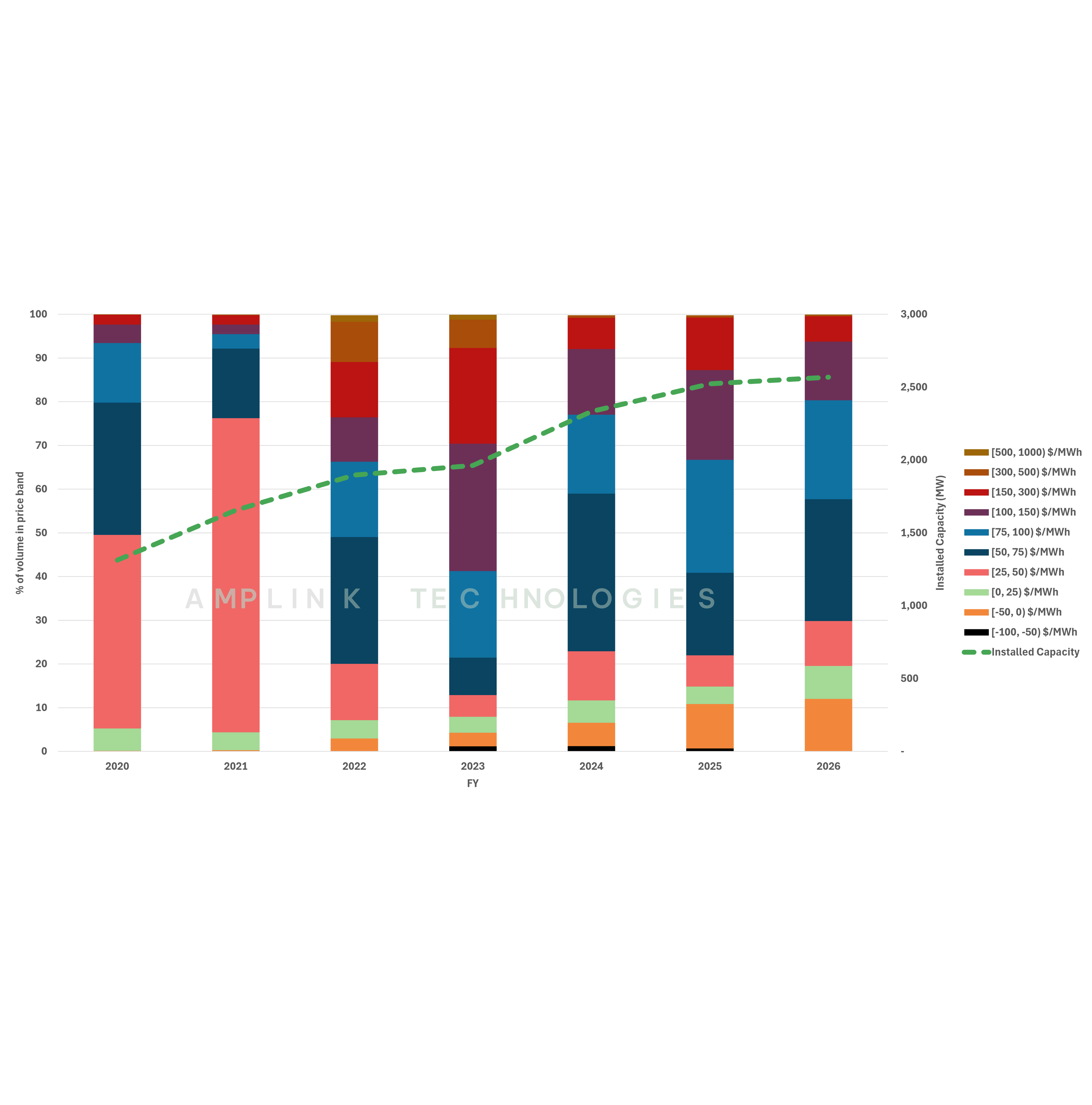
We divided every megawatt-hour of wind generation into the wholesale price bands they realised.
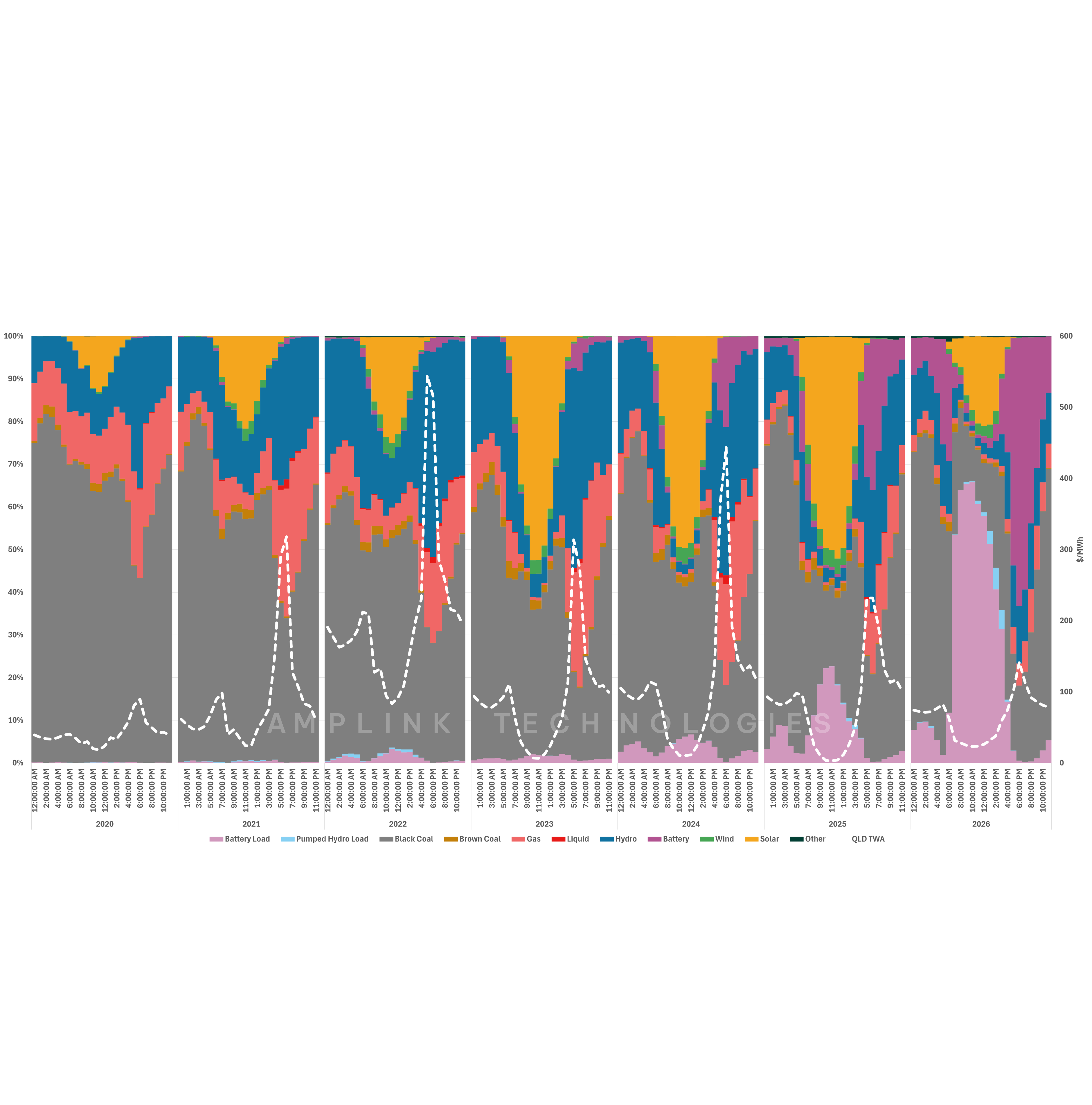
The COVID years provide a useful starting point because until then wind output had mostly been concentrated in relatively modest price ranges. At the height of the COVID slowdown in 2021, around 76% of wind volumes captured prices below $50/MWh (AUD).
Then came FY22.
As seen in Figure 4, in NSW, wind generation landing above $50/MWh increased from 24% in 2021 to 80% in 2022, while the higher price buckets expanded sharply with 60% of wind volumes landing about $100/MWh.
Since then, the market has normalised. Wind is still capturing more volume in attractive price bands than it did through the heart of COVID, but substantially less than during the 2022 extremes; just 20% of wind volumes in 2026 landed above $100/MWh.
At the same time, negative-price exposure is becoming hard to ignore. Generation below $0/MWh has grown from virtually nothing during COVID to 12% last financial year. Over that time installed wind capacity has increased from 1.5 GW to 2.6 GW.
Almost all this negative-price generation sits between $0/MWh and -$50/MWh. This pattern is common across states and likely reflects the protection provided by the value of the government’s large-scale generation certificates (LGCs) as well as contracted revenues like that from power purchasing agreements (PPAs).
And yet, while the lows are getting lower, the highs are also getting higher. The 2022 energy crisis showed how quickly the other end of the price curve can move. Global fuel shocks, thermal outages, constrained supply and weather-driven demand combined to push NEM prices up sharply.
Such circumstances may or may not repeat, but the potential for extreme pricing certainly remains. As coal retires, the remaining thermal fleet ages and demand evolves, scarcity periods could become even more valuable for generators able to produce through them.
To see where the upside and downside really sit, we need to look at the distribution of prices wind captures through time.
Sweet dreams are made of peaks
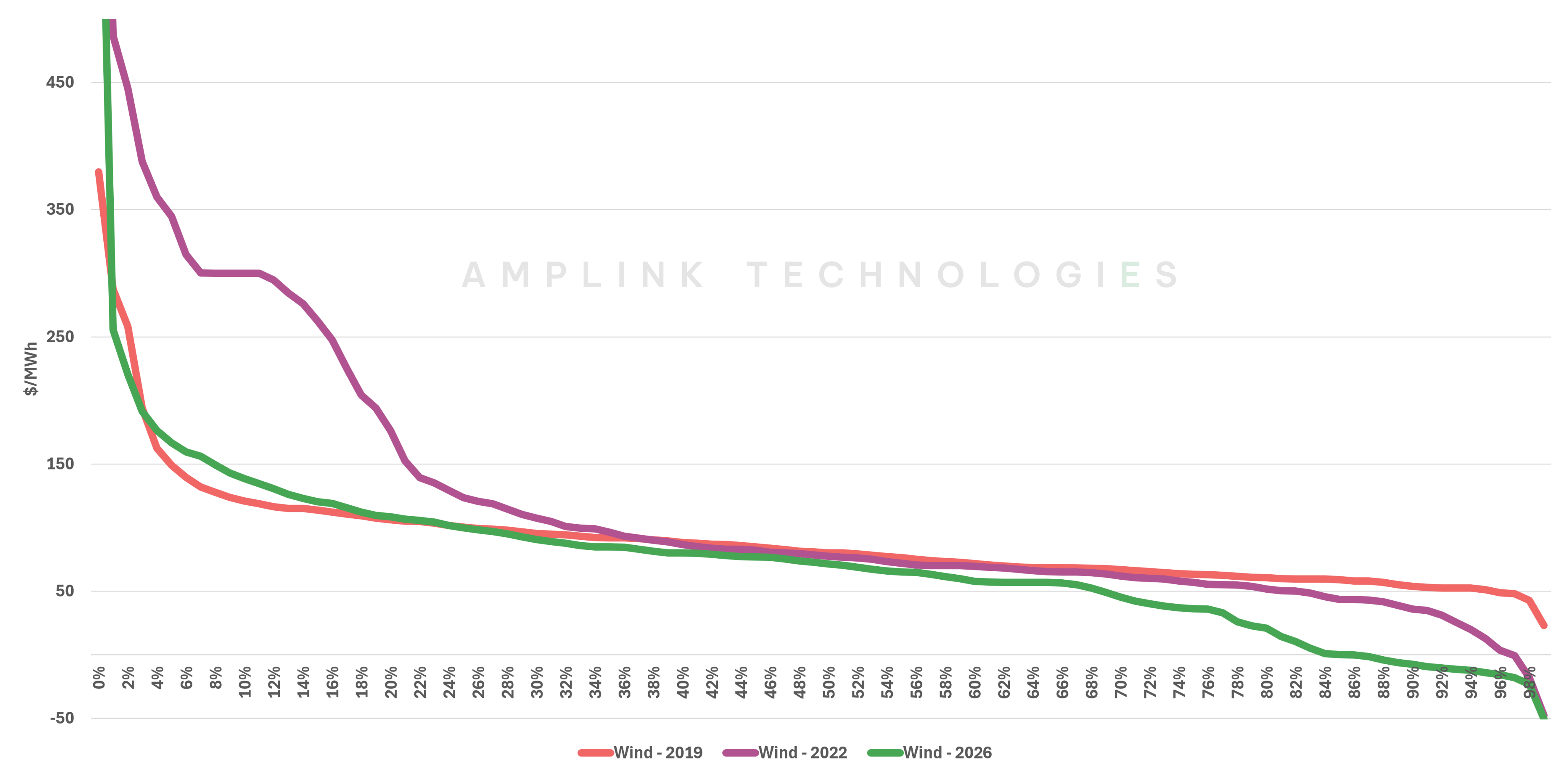
This price duration curve shows that NSW wind is spending more time at the valuable end of the market than it did even before COVID – though nowhere near as much as the 2022 bull run.
In FY19, wind captured prices above $150/MWh in around 5% of intervals. Today, that has increased to around 9%. During the 2022 energy crisis though, NSW wind spent around 22% of intervals above $150/MWh.
Since 2022, the bottom end of the curve has also changed decisively though. NSW wind now spends around 14% of intervals below $0/MWh, compared with none in 2019. This reinforces the trend flagged earlier: negative-price exposure is now a regular feature of the NSW wind market.
These low-price periods are unlikely to disappear. The important question for wind investors is therefore how to balance the books in this new reality. A few high-priced intervals can carry disproportionate annual value. A project doesn’t need high prices all year, it just needs to be generating when the system is tight and prices spike. 2022 demonstrated just how materially the price curve can move when the system is short. That particular mix of shocks may not return, but a market with less coal, an older thermal fleet and changing demand is likely to have other tight intervals. And wind generating at the right time stands to benefit.
This makes the current slowdown in wind investment especially interesting. If fewer projects reach financial close today, there will be less competition for those valuable intervals later in the decade. That said, the upside will not be shared evenly. Projects with lower correlation to the existing fleet, better transmission access and generation profiles capable of aligning with tighter periods will be better placed to capture the top end when it arrives.
That is where Amplink’s forward view becomes particularly useful. Our modelling points to clear winners – assets capable of capturing seriously attractive value even as negative-price exposure grows and the broader wind market becomes more selective.
Whilst you can’t always get what you wind, the right wind can still get paid.
–
* AEMO’s 2026 ISP

.png)